Marking elements expandable using aria-expanded
ARIA provides an attribute which allows to describe the expandability status of an element. It works pretty uniformly in modern browsers and screen readers, and as such is a good solution for many situations where an element's visibility should can be toggled.
Background
In modern web applications there are often situations where the user needs to be able to toggle an element's visibility.
On a visual level, this status typically is indicated using an icon, for example a "+" for an accordion item or a "?" for a tooltip. But this information needs to be available also on the semantical level, so screen readers can announce it.
Intended use
On a semantical level, the aria-expanded attribute is a good choice to convey that an element's visibility can be toggled, together with its current state:
<button aria-expanded="false">Toggle</button>
A screen reader will announce:
Toggle. Button collapsed.
If the button is activated (and the aria-expanded status is changed to true by JavaScript), the screen reader will announce this change:
Expanded.
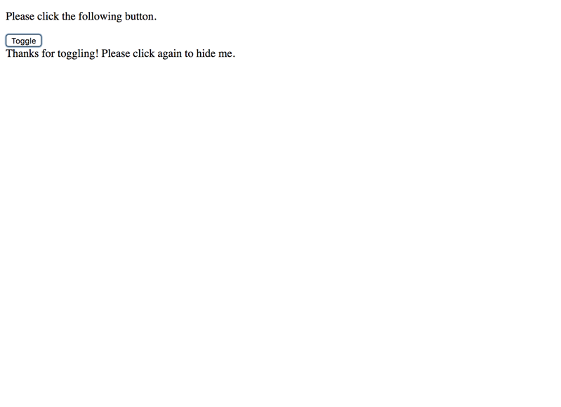
Marking an element expandable using aria-expanded
Adding haspopup (optional)
There is a similar ARIA attribute, aria-haspopup, which leads screen readers to announce an element as having a menu.
<button aria-haspopup="true">Toggle</button>
A screen reader will announce:
Toggle. Button has menu.
Marking an element expandable using aria-haspopup
In contrast to aria-expanded, aria-haspopup does not offer anything better: both tell the user that there is something to be toggled. But while aria-expanded offers a way to provide feedback to the user upon activation, aria-haspopup has not (setting it to aria-haspopup="false" using JavaScript does not make any sense). So it should always be used in combination with aria-expanded (which renders it obsolete again).
We do not recommend to use aria-haspopup as it does not provide any additional value.
Real world use
As shown above, if the button's aria-expanded value is changed using JavaScript while it is focused, screen readers announce the change. This is pretty exceptional, as most other changes to an element are not detected by screen readers (and as such not announced).
In line with the requirement that every user interaction must result in an adequate feedback (see How to implement websites that are ready for screen reader usage), the aria-expanded attribute is really useful with describing elements like:
- Tooltips, see Tooltip widgets (or: screen tip, balloon)
- Accordions, see Accordions
- Autocompletes, see Autosuggest widget (or: autocomplete, lookahead, typeahead)
- Dropdowns, see Dropdown widget (or: menu, pulldown)
- Dialogs, see Dialog widget (or: modal, popup, lightbox, alert)
As a general rule, the toggled element should be right below the toggle button, so screen readers will find it easily. If that is not the case, then the focus should be placed inside the element upon toggling it visible, and back to the initial element upon toggling it invisible.
And always choose a distinctive, self speaking name for the toggle button.
In-page change vs. page reload
In general, aria-expanded is used for controls that trigger some in-page change (using JavaScript). On the other side, if a control causes a traditional page refresh, aria-expanded is not appropriate.
For example, if a navigation is made of nested lists of links, and clicking a link would open/close a sub list using JavaScript, aria-expanded should be used. However, if clicking a link would open/close a sub list via a page refresh, aria-expanded is not needed.
Alternative technique using checkbox
Instead of fiddling around with ARIA, you can achieve the same result using a traditional checkbox (styled to your likings).
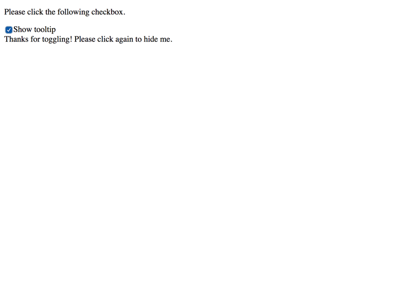
Marking an element expandable using a checkbox
While this is even more robust than using aria-expanded, it may feel out of place within a "real" form.
Conclusion
If you need to describe the expandability status of interactive elements, aria-expanded is one of the few ARIA attributes we truly recommend for general use.
You could be also interested in
Knowledge is power! Our guide has more to offer about: